Box Model
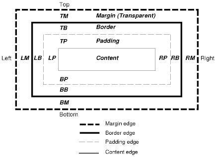
Each element is considered to be contained within its own box. A box comprises a content area, padding, border and margin areas. The diagram on the right shows how these components make up the CSS Box Model.
By changing the values of each component's properties, the presentation, layout and positioning of the element can be controlled. The size of the padding, border and margin can be changed, and the color and style of the border can also be amended. Different values may be applied to each of the four sides of a model's component. The content area would typically contain text or images.
There are a few rules which apply to the box model. The background of the box, whether it be a colour or an image extends to the outer edge of the border.
If the border is specified as dotted. dashed or double, the underlying colour or image will be seen in the border's gaps.
If you are going to be concerned about absolute measurements for your boxes, it is important to note the following.
The width: property specifies the width of the content area but the display width of the element is made up of the following:
border-left-width: + padding-left: + width: + padding-right: + border-right-width:
Therefore if you have a content width of 200px, and padding left and right is 10px and borders are 2px, the actual display width of the whole element would be 224px (200+10+10+2+2).
The implementation of CSS in some earlier browsers, notably IE4 and IE5 (for Windows and Mac), can cause problems in this area.
They have a different take on the matter. They interpret width as the display width.
Therefore if our element has the same property values as above, the content width would only be 176px (200-10-10-2-2).
Further discussion of the model's properties can be found in the topic Margins, Padding and Borders
TopBlock-Level & Inline-Level Elements
This box model is applied to both block-level elements and inline-level elements.
A block level element is an element that is formatted visually as a block (e.g. <div>, <p>).
An inline-level elements is an element that does not form a block of content (e.g. <span>, <em>).
These create block boxes and inline boxes.
If a block box contains other block boxes, it is considered to be the containing block for those block boxes. The position of a block box is relative to its containing block but is not necessarily confined within that block, it may overflow. An initial containing block may have a width and height specified for it but it cannot be floated or positioned.
If a block box contains block and inline content, the inline content is assumed to be in a block box. This is known as an anonymous block box and makes formatting of inline content easier. In the following example the string "Some text" has an anonymous block box generated for it.
<div>
  Some text
  <p>Other text</p>
</div>
There is a similar situation when a block box content contains inline content some which is not contained within an inline element. In this case an anonymous inline box is generated. In the next example the string "Some text" will have an anonymous inline box generated for it.
<p>
  Some text
  <b>Bold text</b>
</p>
The expression collapsing margins means that adjacent margins of two or more boxes, they may be next to one another or nested, combine to form a single margin.
In CSS2 horizontal margins never collapse. Vertical margins will collapse providing the box is not a floating box or it has not been absolutely or relatively positioned.
display: property
There is a property, display:, which can determine how the browser displays an element.
Each element has its own default of course, but this can be overriden by assigning a different value to its display: property.
There are some 17 values which it can have but because of browser support for them there are only a limited number which have practical use.
I am only going to cover three of them here; block, inline and list-item.
These have the effect of converting an element to behave like a different type.
A block element like paragraphs, instead of stacking vertically above each other, can be forced to be positioned sequentially on the same line by setting the value to inline.
An inline element can be made to stack vertically like a paragraph by setting its display value to block.
Inline elements can be converted to a list by appyling the list-item value.
These are all demonstrated in the following examples.
<p>
<a href="CSSIntro.html">Introduction</a>
<a href="CSSBasics.html">Basics</a>
<a href="CSSSStyleOrder.html">Style Precedence</a>
<a href="CSSSelectors.html">Selectors</a>
</p>
<p>
<a href="CSSIntro.html">Introduction</a>
<a href="CSSBasics.html">Basics</a>
<a href="CSSSStyleOrder.html">Style Precedence</a>
<a href="CSSSelectors.html">Selectors</a>
</p>
This would normally display like this:
Let's apply a value of block and a value of list-item to the elements in each paragraph.
<style>
p#display1 a {display: block;}
p#display2 a {display: list-item;}
</style>
.....
<p id="display1>
<a href="CSSIntro.html">Introduction</a>
<a href="CSSBasics.html">Basics</a>
<a href="CSSSelectors.html">Selectors</a>
<a href="CSSValues.html">Values</a>
</p>
<p id="display2">
<a href="CSSIntro.html">Introduction</a>
<a href="CSSBasics.html">Basics</a>
<a href="CSSSelectors.html">Selectors</a>
<a href="CSSValues.html">Values</a>
</p>
Now we'll set the display to inline for both paragraphs.
<style>
p.display3 {display: inline;}
</style>
.....
<p class="display3">
<a href="CSSIntro.html">Introduction</a>
<a href="CSSBasics.html">Basics</a>
<a href="CSSSelectors.html">Selectors</a>
<a href="CSSValues.html">Values</a>
</p>
<p class="display3">
<a href="CSSIntro.html">Introduction</a>
<a href="CSSBasics.html">Basics</a>
<a href="CSSSelectors.html">Selectors</a>
<a href="CSSValues.html">Values</a>
</p>
This is probably not something you want to get too carried away with, it's best to leave it to the natural order of things.
After all, if you want a list, what's wrong with using <ul>.
Having said that though, it can be useful, in fact the menu on this page uses display: block for the links which are inline elements by default.
Page Layout
The old (unwritten) standard for page layout is to use HTML tables. This unfortunately leads to a plethora of tags in the page making it less maintainable. A common practice is to also use a 'spacer' .gif file, usually a one pixel image, to give required spacing between elements. However all this leads to extra download time and bandwidth.
Using CSS positioning techniques provides a much more efficient way of achieving the same results without clogging up the page with hundreds of extra tags and keeping download times and bandwidth to a minimum. CSS provides positioning properties which used on their own or in a combination with others can be used to perform such things as overlaying elements and displaying multi-column layouts.
There are three positioning schemes available for the positioning of boxes in a page.
There is the normal flow of the document of course. Block-level elements are laid out vertically one after the other within their containing block. Inline-level elements are laid out horizontally in a row starting at the top of a containing block.
Blocks can be floated using the float: property and they can positioned as defined by the position: property.
The sections below discuss the rules that govern floating and positioning. The chapters 'Floating' Page Layout and 'Positioning' Page Layout give examples of how to apply these techniques when constructing a multi-column layout for a page.
TopFloating
The float: property is used to float a box to the left or the right.
float: left;
float: right:
Subsequent content flows alongside the side of the box and will eventually wrap below the box.
An example of this can be seen at the top of this page where the box model image is floated right and the subsequent text flows along the left hand side of the image and eventually underneath it. The clear: property may be used to prohibit this and force the content below the floating box.
clear: left;
clear: right;
clear: both;
left and right prevent the flow alongside left and right floated boxes respectively and both will prevent it for both types.
A floating box should have a width specified.
This is done by using the width: property.
Multiple floating boxes may be adjacent to each other. This is the basis for a multi-column layout using floating. Margins of floating boxes do not collapse with margins of adjacent boxes. That is, they cannot be combined to create a single margin.
TopPositioning
Positioning can be a little confusing because it is dependant upon the context in which the box to be positioned is placed.
The position: property is the prime property used in positioning.
It is normally used in conjunction with the bottom:, left:, right: and top: properties.
These properties specify the position of a box relative to its containing block.
position: has four possible values, absolute, relative, static and fixed.
staticis the default value and means that the box is placed in the normal flow of the document.-
absoluteis used to precisely position the box in question. Thebottom:,left:,right:andtop:properties are used to specify an offset for the element within its containing block. The important thing to note with absolutely positioned elements is that they do not occupy any space in the normal document flow, they literally 'float' above any underlying content. fixedis similar to absolute except that when the page is scrolled, it maintains its position within the window instead of scrolling with the rest of the page. Unfortunately this value is not properly supported by Internet Explorer so it's use is limited.-
relativepositions the box in relation to its normal flow position. For example, if it were given the following property values;top:20px andleft:-10px; it would position itself 20 pixels below and 10 pixels to the left of where it would normally be positioned. Any offset is ignored by the following box in positioning itself.
If a block is absolutely positioned, its containing block is the nearest ancestor which has a position: value other than static.
If there is no ancestor, the containing block is the root element.
Note that in XHTML (and HTML) the root element is <html> not <body>.
This means that the containing block starts at the top left corner of the document outside of any margins set for <body>.
A common practice is to create a relatively positioned <div> and use this as the containing block for an absolutely positioned block.
Layering
Because blocks can be absolutely positioned, there is the potential for blocks or parts of blocks to occupy the same area in the document, for example:
<div style="margin-left: 30px; position: relative; width: 100px; height:100px;">
   <div style=" background-color: red; position: absolute; top:0; left: 0;">
      <p>A red box</p>
   </div>
   <div style="  background-color: blue; position: absolute; top: 15px; left: 15px;">
      <p>A blue box</p>
   </div>
   <div style=" background-color: green; position: absolute; top:30; left: 30px;">
      <p>A green box</p>
   </div>
   <div style="  background-color: yellow; position: absolute; top: 45px; left: 45px;">
      <p>A yellow box</p>
   </div>
</div>
A red box
A blue box
A green box
A yellow box
In this example, the blue box is overlaying the red box by virtue of the fact that it follows the red box in the normal document flow.
This can be altered by using the z-index: property.
Normally an HTML document is considered to be two dimensional, in fact we can specify x and y coordinates to position boxes.
Because of the layering we have created, we effectively have a third dimension, the z-axis.
By giving z-index: an integer value, it establishes its position in the hierarchy, the higher the number, the higher the layer.
So using the last example we can rearrange these layers according to their z-index: value.
<div style="margin-left: 30px; position: relative; width: 100px; height:100px;">
   <div style=" background-color: red; position: absolute; top:0; left: 0;
	 z-index: 4;" >
      <p>A red box</p>
   </div>
   <div style="  background-color: blue; position: absolute; top: 15px; left: 15px;
	 z-index: 3;">
      <p>A blue box</p>
   </div>
   <div style=" background-color: green; position: absolute; top:30px; left: 30px;
	 z-index: 2; ">
      <p>A green box</p>
   </div>
   <div style="  background-color: yellow; position: absolute; top: 45px; left: 45px;
	 z-index: 1;">
      <p>A yellow box</p>
   </div>
</div>
A red box
A blue box
A green box
A yellow box
As you can see, the boxes still take the same position but the order of the layers is completely reversed. This is a useful technique for layering text over images.
Top
